Web design
SEO Goals Setting Tool
Role
UX/UI Designer
Duration
3 Days
Tools
Figma & Adobe Illustration
Client
Personal Project (POC)
01.-
Context
Overview
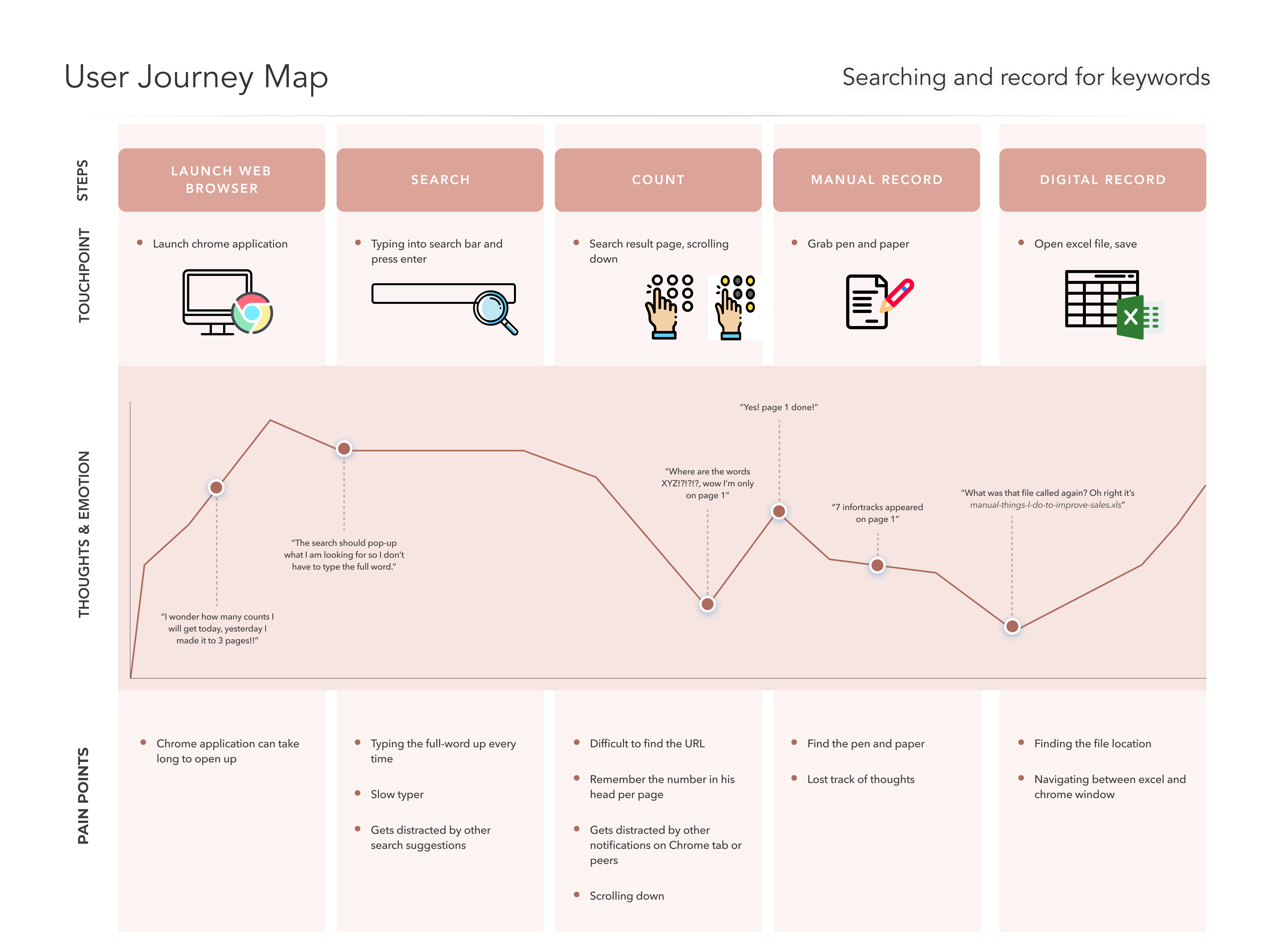
The CEO is very interested in SEO and wants to improve sales. Currently, he types in “online title search” and counts down to see where and how many times his company, XYZ, sits on the list. This project can be time consuming and unreliable where counts can lose track.
Note: This project is not a billable project and was only considered as part of everyday design practise.
02.-
Research
Background Research
A lot of research goes into how the SEO software application works. Looking at competitors, I gathered common features and analyse their tool to understand the purpose of an SEO and the potential of the application.
03.-
Empathise
User Persona
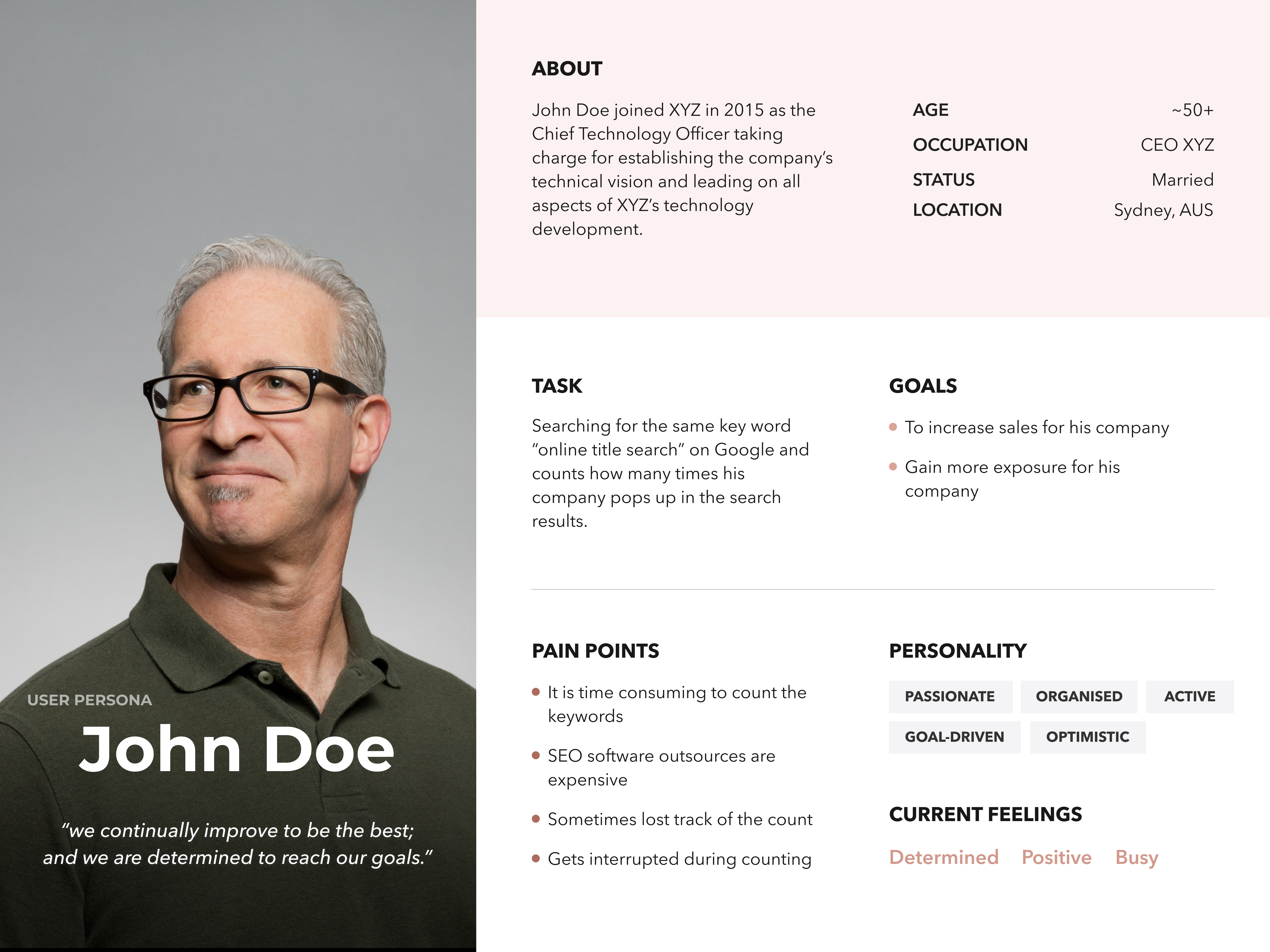
Completing the CEO's persona allows me to put myself into a manager's role in order to understand their needs and frustrations. Even though the interview with the CEO was not conducted, a thorough research and interview were carefully studied and investigate to create this user persona.


Problem statement
How might we improve sales for busy business owner using SEO
04.-
Ideate
Features
After understanding the user's requirement and research into SEO application, I was able to develop the features and requirements to development my own SEO application to fit the design brief.
Adding Keywords
User should be able to add multiple keywords. Suggested keywords should display
Displaying Data
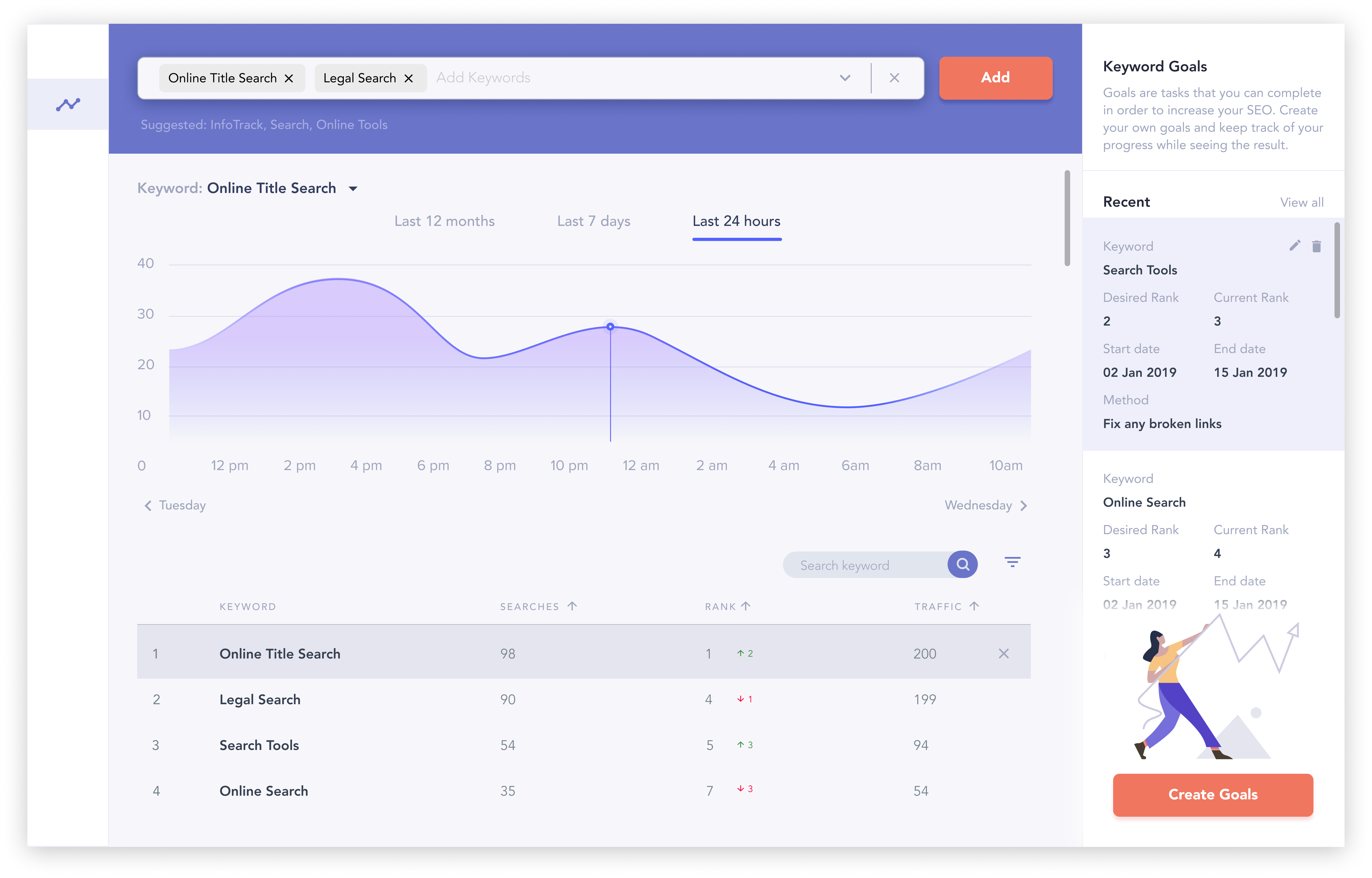
A table display of all the keywords entered by the user. There are the columns heading that would be useful to include [‘Keyword’, ‘Number of searches/time’, ‘rank’]. A line graph to display for each keyword comparing number of searches/time and rank.
Time period toggle
User should be able to switch table data display according to per week, per month and per year.
Set goals
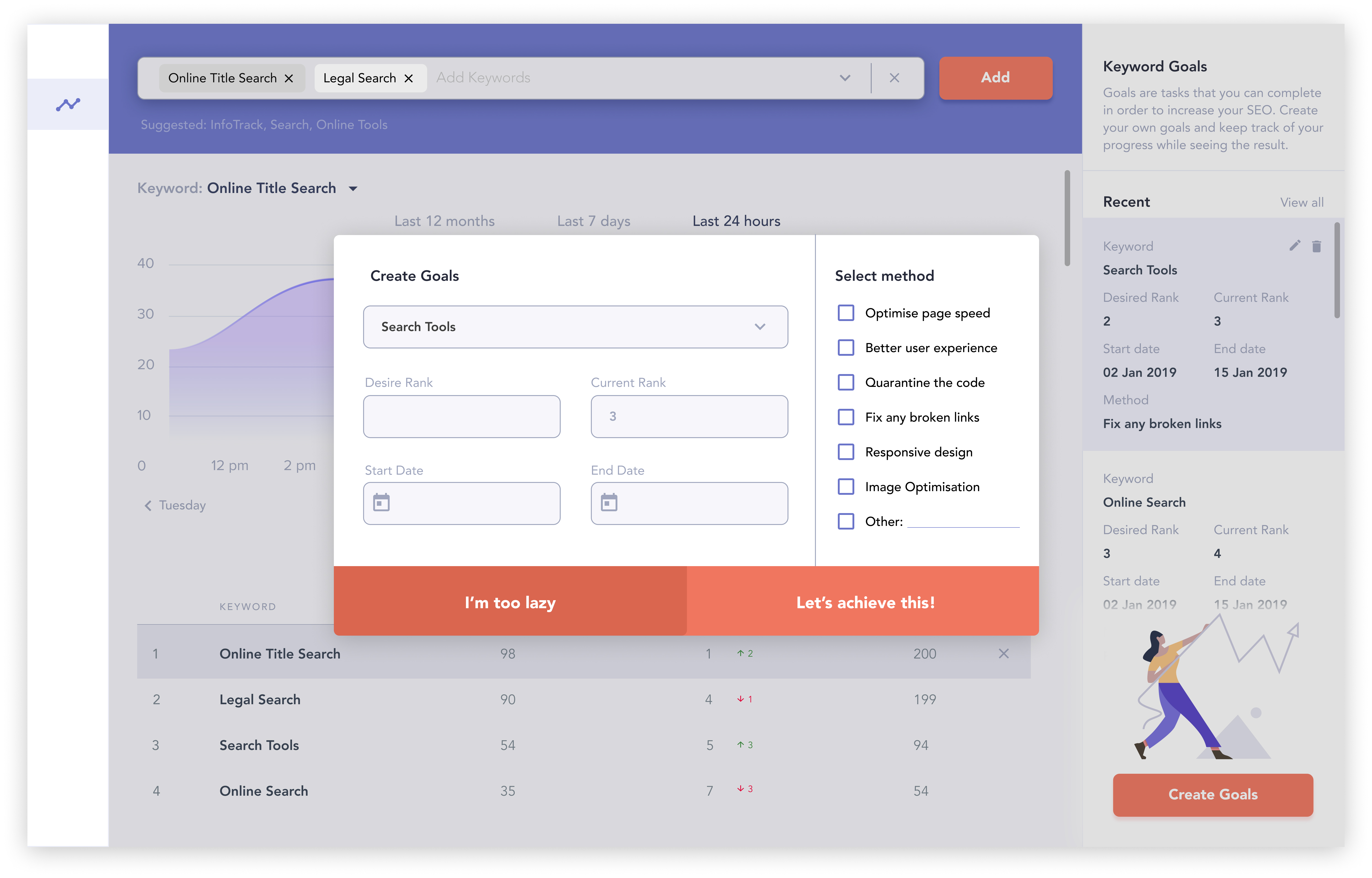
User can create ‘goals’ by adding keyword and desired rank. User can select start and end date User can select a method of how the goal should be achieved.
05.-
Ideate
Prototype
The prototype was made in Figma and took about 2 days to complete. This wireframe is the initial landing dashboard page where most of the functions will be used. The colour scheme of purple and red are used to create a modern illustration feel. Red for call to action buttons draw attention to the user.
The main feature is the keyword search, thus, placing the keyword search functionality on the top of the dashboard is prominent for the busy manager to use.
Along the right hand side is the "Goal" column. This allows the user to take further action and motivates their sales drive to increase the desired keyword ranking.


